If the result set is empty, check for an incompatible combination of filters and input controls, such as a standard filter (set against a Country field) and a complex filter (set against both Country and State).
The Ad Hoc Editor offers additional features that are described in the following sections:
• Using Input Controls and Filters
You can create new fields in a report by applying mathematical formulas to an Ad Hoc report’s existing numeric fields. For example, consider a report that includes both a Cost and a Revenue field. You could calculate the profit for each record by creating a custom field that subtracts the Cost field from the Revenue field. Create a custom field by selecting an existing field in Fields or in the canvas area of a table report; the Create Custom Field menu item appears on the context menu when you right-click a numeric field.
The Ad Hoc Editor supports three types of functions:
• Basic functions include addition, subtraction, multiplication, and division. You can use these functions with a constant (such as multiplying the cost by two to calculate a standard 50% markup), or you can use them with multiple fields. Select multiple fields using Ctrl-click; the columns’ borders change color to indicate that multiple fields are selected; right-click to open the context menu and create a custom field.
• Advanced functions include round, rank, percent of total, percent of row group, and percent of column group. These functions don’t take constants, nor do they support multiple fields.
• Date functions can calculate the difference between two dates in a number of intervals, such as years, weeks, days, and seconds.
A custom field can include only a single function. To use more than one function, create two custom fields, with one building on the other. In this case, pay special attention to the order in which you create the custom fields, as this may affect the results; for example, rounding then multiplying is different from multiplying then rounding.
Because custom fields can build upon one another, you can create complex calculations. For example, you can divide the Profit custom field in the previous example by the Revenue field to express each record’s margin as a percent. When a custom field is the basis of another field, you can’t delete it until you delete the one that builds on it.
When working with multiple fields:
• You can only select basic functions and date differences.
• You can multiply or add any number of fields, but ordered functions (subtract and divide) and date functions can only be used with two fields at a time.
• For ordered operations, the order in which you select fields matters. For example, to calculate profit in the example above, click Revenue first, then Ctrl-click Cost. When you right-click, select Create Custom Field and choose subtraction, the Ad Hoc Editor assumes you are subtracting the Cost field from the Revenue field. You can always change the order of fields by clicking Swap.
To create a custom field based on one field:
| 1. | In Fields, right-click a numeric field and select Create Custom Field from the context menu. |
| 2. | Depending on the type of function you want to create, select options in Basic Functions or Advanced Functions. |
| 3. | In Basic Functions, you can select addition subtraction, multiplication, or division of the field values by a constant, which you enter a number in the selected field; this number is the constant to use in the formula. |
| 4. | If you selected a basic function, click Swap to put the constant before the field in the formula; this is only useful in conjunction with ordered functions. |
| 5. | Click Create Field. |
The custom field appears in Fields.
To create a custom field based on multiple numeric fields:
| 1. | In the list of fields, Ctrl-click two or more numeric fields, right-click one of the selected fields, and click Create Custom Field from the context menu. |
| 2. | From Basic Functions, select +, -, *, or /. |
You can subtract or divide only when exactly two fields are selected.
| 3. | Click Swap from the context menu to change the order of the fields in the formula; this is only useful in conjunction with ordered functions. |
| 4. | Click Create Field. |
The custom field appears in the list of fields.
To create a custom field based on two date fields:
| 1. | In Fields, Ctrl-click two date fields, right-click, and click Create Custom Field from the context menu. |
| 2. | Select one of the Date Difference intervals, such as days. |
You can subtract dates only when exactly two date fields are selected.
| 3. | Click Create Field. |
The custom field appears in the list of fields.
Keep the following in mind when creating custom fields:
• To edit an existing custom field, right-click it and select Edit Formula from the context menu. You can then choose a different function, or enter a different value (if you are editing a basic function).
• When you create a custom field based on a field in the table, the new field appears in the report area; when you create a custom field from a field in Fields, it appears at the bottom of the list.
• The percent of group functions are unique among the custom functions in that they calculate values based on the grouping defined in the report. Thus, the following limitations apply:
• The percent of column group functions are meaningless in charts and tables. In these contexts, these functions always returns 100.
• Custom fields using the special percent functions cannot be used as a group, as a filter, nor as the basis for other custom fields.
• The summary function for custom fields using the percent functions is always Sum; this cannot be modified. Furthermore, the percentage is always calculated on the sum of the original field, regardless of the summary function applied to the field in the table or crosstab, if any.
• The Round function uses the standard method of rounding (arithmetic rounding), in which decimal values greater than 0.5 are rounded to the next largest whole number.
• A custom field’s label is determined by the fields, constants, and functions it includes; for example, the default label for the Profit field in the example above is Store Sales - Store Cost. Right-click the column and select Edit Label to enter a more compelling name.
• By default, the Ad Hoc Editor supports only two decimal places. If the custom fields return data that are significant to the third decimal place, you can add new masking options by editing configuration files. For more information, refer to the JasperReports Server Administrator Guide.
• You can’t delete a custom field that is used in the Canvas. First, remove the custom field from the canvas and then delete it from Fields.
JRXML Topics and Domains use different mechanisms for screening the data they return:
• JRXML Topics can contain parametrized queries. The parameters can be mapped to input controls that allow users to select the data they want to include.
• Domains (and Domain Topics) can be filtered by selecting fields in the Domain and specifying comparison values. The filters can be configured for users to select the data to include.
• Within the Domain design, filters based on conditions can also be defined; they’re never displayed in the editor or in the report viewer when the report runs.
You can define filters regardless of whether you are working with a Domain or Topic. Such filters can be helpful in improving the report's initial performance by reducing the amount of data the report returns by default. If you want to prevent users from seeing the full dataset, use data-level security instead. For more information, see Input Controls and Filters Availability. To prevent users from seeing the full dataset, you can also use Input controls in a JRXML Topic or filters defined in the Domain design, which can be hidden from end users.
Input controls and filters interact seamlessly. For example, you can create filters in an Ad Hoc report that gets data from a JRXML Topic that includes input controls.
Because some combinations of input controls and filters don’t return data, the server refreshes the editor against both the filters and the input controls. Nevertheless, some combinations of filters and input controls may result in no data being returned.
|
|
If the result set is empty, check for an incompatible combination of filters and input controls, such as a standard filter (set against a Country field) and a complex filter (set against both Country and State). |
For more information about:
• JRXML Topics and input controls, see section Adding Input Controls.
• Domain Topic filters, see section Choosing Ad Hoc Data From a Domain.
In the Ad Hoc Editor, you can display the input controls defined in the Topic as visible to users. You can accept the queries’ default values or enter other values. The Ad Hoc Editor indicates that the report has input controls by displaying  as active. Click this icon to select new values or to save values as the new defaults for this report. The following procedure shows how to accomplish these tasks.
To create an Ad Hoc report that has input controls:
| 1. | Choose Create > Ad Hoc Report. In Data Chooser, choose Parametrized Report from the list of Topics. Click Table. |
The Ad Hoc Editor opens.
| 2. | In the Fields panel, double-click the Order ID and Freight fields. |
| 3. | Drag the Customer Id field from Fields and drop it on the Group Control icon,  . . |
To edit the values for a report’s input controls:
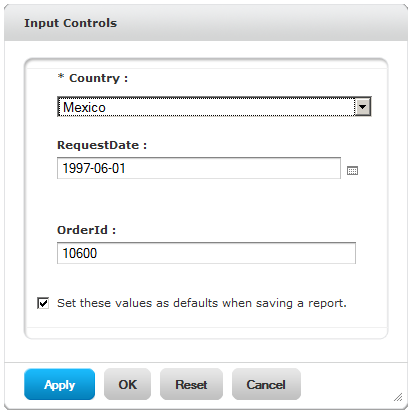
| 1. | On the Canvas, click . |
A window listing the input controls defined in the Topic appears.
|
|
|
Input Controls in the Ad Hoc Editor |
|
|
The Parametrized Report topic already includes three input controls, created in iReport Designer: Country, RequestDate, and OrderId. |
| 2. | Select new values. For example, in Country, select USA. |
| 3. | To change default values of input controls, select the check box, Set these values as defaults when saving report. |
The selected values become the default values when you save the report. If you deselect the check box, the previous default values are used.
| 4. | Click OK. |
The report design on the canvas shows USA data.
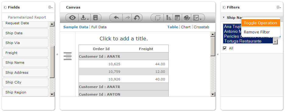
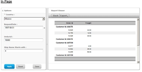
To add another input control to the report using a filter:
| 1. | Drag Ship Name from Fields to the Filters panel. |
| 2. | In Filters, click the  icon beside Ship Name, and select Toggle Operation. icon beside Ship Name, and select Toggle Operation. |
|
|
| 3. | Select starts with from the drop-down and type a in the text box below the drop-down. |
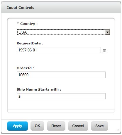
The report design on the canvas changes to show only data shipped to companies with names starting with a. The Ad Hoc Editor adds the filter as to the Input Controls dialog box that appears when users run the report.
| 4. | Click  , select Save Report As, name the report, select a location, and click Save. , select Save Report As, name the report, select a location, and click Save. |
| 5. | On the Canvas, click . |
Only the input controls defined in the Topic appear. You need to run the report to see a filter listed in Input Controls.
| 6. | Click View > Repository, locate the report, and run it. |
| 7. | In the report viewer, click Options. |
Now, you can see the Ship Name Starts With filter that you added to the input controls of the report:
|
|
|
A Filter Added to Input Controls |
Filters can be defined at three levels:
• In the Domain Design.
• When creating a report from a Domain (in the Data Chooser).
• In the Ad Hoc Editor (even when the report is based on a JRXML Topic).
To create a filter:
| 1. | Right-click a field in Fields and click Create Filter. |
A new filter appears in the filter pane. If the filter pane was hidden, it appears when you create a new filter.
|
|
If the results are empty and you don’t understand why, check for an incompatible combination of filters and input controls. Click |
| 2. | Depending on the datatype of the field you selected, the filter maybe multi-select, single-select, or text input. |
| 3. | Use the fields in the Filters pane to change its value. |
| 4. | Click , then select Minimize All Filters or Maximize All Filters to toggle expansion of the items in the filter. |
| 5. | Click , then select Remove All Filters to remove the filters. |
| 6. | Click  to hide the filter’s details. Click to hide the filter’s details. Click  to display them again. to display them again. |
| 7. | Click the All check box to select all values currently available in the dataset. |
Note that the All check box doesn’t guarantee that all values are selected every time the report runs. Instead, the check box is a shortcut to help you quickly select all the values currently available in the dataset. To ensure that all values appear in the report whenever it is edited or run, remove the filter entirely. For more information, see Using Input Controls and Filters.
You can also create a filter from the context menu of columns in tables. On the Chart tab, you must right-click the field in Fields.
When you change a filter, the server uses the new value to determine the data to display. If you change only the operator in a single-select filter, the server doesn't apply the filter automatically; press Enter or Tab to apply the new values. You can also click the current value to force the editor to update the view.
|
|
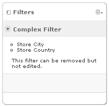
When you right-click a group member in a crosstab and select Keep Only or Exclude, you create filters. When you create a filter against an inner group, the filter that appears may be created as a complex filter as shown in See "A Complex Filter in the Ad Hoc Editor"; a complex filter can’t be edited but it can be removed. Complex filters aren’t available when the report is run. Similar complex filters also appear in the Ad Hoc Editor if a Data Chooser wizard filter was created and locked. |
|
|
Input controls and filters can appear in the editor and before or after the report runs:
• Input controls can be set to be visible or invisible when you edit a report:
• Input controls set to Always prompt are displayed in the editor and always appear before the report is run.
• Input controls that aren’t set to Always prompt are always hidden in the editor and hidden when the report is run.
• Filters defined in the Domain design are always hidden in the editor and when the report is run.
• Filters created in the Data Chooser wizard can be locked or unlocked:
• Filters that are unlocked display filter information in the editor and are available from the Options button when the report is run.
• Filters that are locked display input controls in the editor when you click  to view the report in display mode but are not available from the Options button when the report is run. Users can remove the filter while in the editor, allowing users to see all the data unfiltered when the report is run.
• You can’t change whether the filter is displayed after the report is created.
• Filters defined in the editor are always available in the filters pane of the editor and from the Options button when the report is run.
When setting up input controls for a huge report that takes a long time to run, consider setting the report to Always prompt. Before a report is run, the Report Viewer prompts you to provide the input options, preventing the report from running using the default input options.
Filters that are unlocked are available. When input controls or filters do not appear in the Report Viewer, click the Options button to view them. You can learn more about how filters and input controls interact in the editor by walking through the data exploration tutorial with the filter pane open. See section Exploring and Analyzing Data in the Ad Hoc Editor.
To set an input control to always prompt:
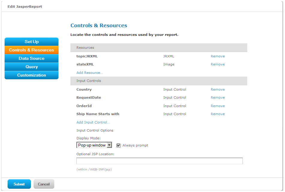
| 1. | Locate a Topic, such as the Parametrized Report Topic, in the repository and click Edit. |
| 2. | On the Controls & Resources page of the JasperReport wizard, under Input Control Options, select Always prompt: |
|
|
|
The Always Prompt Setting |
To determine whether an input control is visible:
| 1. | Locate a Topic, such as the Parametrized Report Topic, in the repository and click Edit. |
| 2. | On the Controls & Resources page, click the name of an input control, such as Country. |
| 3. | On the Locate Input Control page, click Next. |
At the bottom of the Create Input Control page, if the Visible check box is selected, the input control appears on the report when it runs. For more information, see Adding Input Controls.
|
|
If you don’t provide a default value for the input control, users are prompted to select a value when they create a report based on the Topic. |
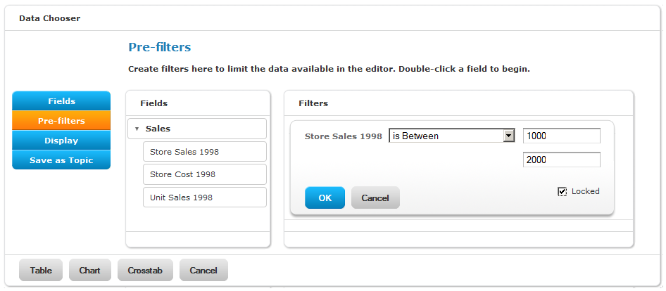
To lock editing of a filter:
| 1. | Click Create > Ad Hoc Report. |
| 2. | In the Data Chooser wizard, click Domains to create a new report based on a Domain. |
| 3. | Click Choose Data. |
| 4. | In Fields, move tables and fields from Source to Selected Fields. |
| 5. | Click Pre-filters. |
| 6. | Double-click a field in the Fields panel. |
| 7. | In the Filters panel, define a filter as described in section The Pre-filters Page. |
| 8. | Check the Locked box, as shown in See "A locked filter", and click OK. |
|
|
| 9. | Click Table to open the Ad Hoc Editor. |
In the Filters panel, the name of the filter and a note about the lock appears:
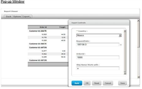
When you run an Ad Hoc report, the default behavior is to display input controls in a pop-up window when you click Options. If your user account has sufficient privileges, you can edit the saved report to make the input controls and filters appear at the top of the page or on a separate page.
To change the display options for an Ad Hoc report's input controls and filters:
| 1. | Log in to JasperReports Server. |
| 2. | Click View > Repository and locate an Ad Hoc report that defines input controls and filters. |
| 3. | In the repository, select the report’s row, and click Edit. |
|
|
To edit the report, your login account must have write privilege to the report. |
The Set Up the Report page of the JasperReport wizard appears.
| 4. | Click Controls & Resources. |
The wizard displays the Controls & Resources page.
| 5. | In Input Control Options, select one of the following values from the Display Mode drop-down menu: |
• Pop-up window – Input controls and filters appear in a window overlaid on the report page. You can move the window and keep it open while changing values, or you can set values and close it.
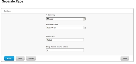
• Separate page – Input controls and filters appear on their own page, separate from the report. You set the controls on this page, then click Run to view the report. The controls page and report page alternate if you display the controls again, so that you never see both together.
• In page – Input controls and filters appear at the top of the report page. When page real-estate is an issue, use this option to save space on the page.
See Input Controls and Filter Display Options for an example of each display option.
| 6. | To prompt the user for input values before running the report, select the Always prompt check box. Click Submit. |
| 7. | Click View > Repository and locate the report. |
| 8. | Click the report name or click the name of a saved input control to run the report. |
The input controls and filters are displayed according to the display mode specified in step 5.. The display mode applies to all input controls of a report, even if input controls were saved before changing the display mode.
|
|
|
|
|
|
For more information, see section Setting the Input Control Options.
In the Ad Hoc Editor, the  icon lets you change how the groups are displayed. Depending on the type of report you are viewing, the behavior varies:
• In crosstabs, the server moves the row groups to column groups and vice versa. This action is also referred to as pivoting. This option is available only for crosstabs that have both a column group and a row group.
• In charts, the server displays the alternate group. This option is available only for charts that have a column group. When multiple row or column groups are defined, the Chart tab displays the outermost group.
• In tables, the server displays the alternate group. This option is only available for tables that have a column group. When multiple row or column groups are defined, the Table tab displays the first group in the set (the outermost group).
By default, a table or chart is grouped by the column group; click to group it by the row group.
The icon is available only on tables and charts the have been edited on the Crosstab tab to add a column group. Otherwise, there is no alternate group to switch to.
To use the to display an alternate group on a table or chart:
| 1. | Design a table or chart in the Ad Hoc Editor. |
| 2. | The design has only a row group defined. |
| 3. | Click the Crosstab tab. |
| 4. | Drag a field into the column group. |
| 5. | Click the Table or Chart tab. |
| 6. | Click to display the alternate group. |
|
|
For example, you could create a bar chart that showed the sales by region. By switching to the Crosstab tab, you could add Client Industry as the column group. Back in the Chart tab, switch the groups to display the sales data grouped by Client Industry. This comparison can help you identify trends and outliers in the data. |
In the Ad Hoc Editor, you can sort the rows of a table by one or more fields. You can also sort crosstabs; for more information see Working with Crosstabs.
To sort a table:
| 1. | Click  . . |
The Sort window appears. If the table is already sorted, the window shows the fields that are used.
| 2. | To add a field to Sort On, double-click the field in Available Fields. |
The Available Fields panel refreshes the list of available fields. It lists only fields that are not already in Sort On.
| 3. | Select one or more fields to sort by, and click OK. Press Ctrl-click to select multiple fields, then click  . . |
The Sort window reappears with the selected fields.
| 4. | To arrange the sorting precedence of the fields, select each field in the Sort window and click the Move to top, Move up, Move down, or Move to bottom buttons:  , ,  , ,  , ,  . . |
| 5. | To remove a field, select it and click  . . |
| 6. | Click OK. |
The table updates to display the rows sorted by the selected fields.
|
|
When sorting a table:
|
||||||
|
|
To sort a crosstab, click the icon next to a measure’s label. For more information, see Working with Crosstabs. |
Charts are graphical representations of the data. The Ad Hoc Editor can create both summarized and unsummarized charts:
• Summarized charts show data grouped and summarized:
• Bar. Compares values displayed as bars.
• Pie. Compares values displayed as slices of a circular graph.
• Line. Compares values displayed as points connected by lines.
• Area. Compares values displayed as shaded areas.
• Unsummarized charts show each data point individually, and don’t support grouping:
• Scatter. Compares values expressed as pairs of values that determine the position of a point on the chart.
• Time Series. Compares values based on times or dates associated with the data. Use a date field as the group.
Because these charts are unsummarized, the Change Summary Function option is not available for them.
When you create a chart, you generally indicate how to arrange the data by specifying:
• A group field. Similar to the table's grouping option, a chart’s group field determines how data are categorized. For example, in a bar chart, the category field determines how the bars are grouped; in a pie chart it determines what each slice represents.
Note that time series and scatter charts don't support grouping; instead, each data point is mapped individually. The data aren’t summarized.
• Measure fields. Measures are the other data in the chart. They determine the length of bars, size of pie slices, location of points (in line charts), and height of areas.
Charts have different layout and format options from tables and crosstabs. When designing charts, keep these points in mind:
• By default, the Ad Hoc Editor creates a bar chart. You can select a different type of chart at any time.
• The Ad Hoc Editor automatically hides all but the first measure if you change to a pie chart, because pie charts can show only a single measure.
• Before any fields are added to the chart, the Ad Hoc Editor displays a simple placeholder with the legend displaying a single entry: No Data. As you add groups and measures, the mock-up changes to reflect the data in the chart. For example, when you add a group to a pie chart, the pie displays the correct number of pie slices; when you add a measure to a bar chart, the Y-axis units and values show the range of values in the measure you selected. After you have added at least one group and one measure, the mock-up is replaced by the chart, and you can save or run the report.
• Fields can be added as groups or measures. To add a field as a group, drag it to the group icon . To add a field as a measure, drag it into the canvas or right-click it in the list of fields and select a menu item from the context menu. You can add fields more than once; for example, you can add a field as both a measure and a group.
• You can rename the measures displayed in the chart by right-clicking the measure’s label in the legend and selecting Edit Legend Label from the menu that appears. The text you enter replaces the field’s name. This menu item is also available on the chart context menu.
If you change the measure’s summary function, the label updates to reflect the change. If you change the summary function back, the last name entered for that measure with that summary function appears.
• For each type of chart, the context menu provides these display options:
|
Type |
Description |
||||||||||||
|
All Chart Types |
Regardless of the type of report, you can:
Note that the gradient doesn’t appear when you run the report. |
||||||||||||
|
Area Chart |
When creating an area chart, you can indicate whether the groups should be displayed as transparent overlays or as solid areas. Select Stacked Series to display the groups as solid areas arranged vertically, one on top of another; select Simple Series to display groups as transparent overlays. As compared to line charts, area charts emphasize quantities rather than trends. |
||||||||||||
|
Bar Chart |
When creating a bar chart, the context menu provides these options:
|
||||||||||||
|
Line Chart |
When creating a line chart, you can indicate whether to display markers at each data point and lines that join them. Select Hide Lines or Hide Points to remove the indicators from the chart. |
||||||||||||
|
Pie Chart |
When creating a pie chart, you can indicate whether to use a Flat Pie (which is two dimensional), or the default, which is three dimensional (3D Pie). |
||||||||||||
|
Scatter |
When creating a scatter chart, you can indicate whether to display markers at each data point and lines that join them. Click Hide Points to remove the marker at each data point. Click Show Lines to add lines that join the data points. |
||||||||||||
|
Time Series |
When creating a time series chart, you can indicate whether to display markers at each data point and lines that join them. Click Show Points to add a marker at each data point. Click Hide Lines to remove the lines that join the data points. |
• You can increase a chart’s size to improve its legibility or you can decrease its size if it’s intended for use in a Jaspersoft Dashboard or JSR-168 compliant portal, such as Liferay. When you place the cursor over the right-hand or bottom edge of the chart, the resize arrow appears; click and drag the edge of the chart to increase or decrease its size.
For more information about portal integration, refer to the JasperReports Server Administrator Guide.
• By default, the page is set to Actual Size, which resizes the page to fit the chart’s dimensions.
When you place the cursor over  and click A4 Size or Letter Size from the menu, the Ad Hoc Editor limits the size of the chart to the selected page size. If you enlarge the chart, the Ad Hoc Editor snaps the chart back to the maximum allowable size in either dimension (height or width).
• A scatter chart uses Cartesian coordinates to display values as points whose locations are determined by two variables you select. One variable determines the horizontal position and the other determines the vertical position. It plots paired values against one another.
• Time series charts plot the data against the passage of time. They can help you understand the nature and underlying context of the data, identify trends, or forecast future results. In a time series chart, the horizontal axis must represent a date or time field, such as Purchase Date. If you add a field to the horizontal axis that has a datatype other than a date/time, the Ad Hoc Editor renders the chart as best it can, but the result is likely to be meaningless.
• Unsummarized charts (scatter and time series) can only be run or saved if the fields selected for the X and Y axes are appropriate:
• For scatter charts, both fields must be numeric.
• For time series charts, one field must be a date or date/time, and the other must be numeric.
• You can hide legends and labels to allow the chart more space, or you can show them to make the chart easier to understand. In the chart context menu, click Legends and Labels, and specify whether to hide or show the legend, the group title (which identifies the name of the group field), or measure titles (which identifies the measures).
• Right-click a measure in the legend to edit its label.
• In bar, line, and area charts that display multiple measures, you can change the order of measures by dragging the legend entry right or left. This reorders the measures in each group. While the order of measures is changed, the order of colors is not. Thus, the measures change color as they are reordered. This can be helpful improving a chart’s legibility and visual appeal.
• Remove measures from the chart using the legend or chart context menu. If the chart displays only a single measure, right-click the chart and select Remove Measure. If the chart displays multiple measures, the context menu lists them under the Measures menu item. The measures are listed in the order they appear within the groups. On the chart context menu, click Measures > [Measure Name] > Remove Measure (where [Measure Name] is the name of the measure you want to remove).
|
|
The Measures menu also allows you to change the summary function and data format. It is available from the chart context menu as well as from the legend. |
• Remove a chart’s group by right-clicking the chart and selecting Remove Group from the context menu. You can also right-click a different field in the list of fields, and click Replace Group, or simply drag the new group field and drop it on the group control.
• When working with a chart that displays two measures with very different ranges of values, the chart may be difficult to read or understand. To make the ranges of values more similar, create a custom field that multiplies or divides one of the measures. Consider the case where you are comparing the number of items sold (values ranging from 0-50) and the total sales revenue for each product (values ranging from 0-50,000), you could create a custom field that divided the revenue measure by 1000. Adding this measure in place of the actual revenue measure yields a chart in which the two measures are depicted in closer scale. The new chart is both easier to read and more appealing. Jaspersoft recommends that you note such changes in the legend label or title.
• To add a field in a specific position in a chart, you can drop it in the legend in the desired location. The new measure appears in the correct location in the chart.
Crosstabs have different data, layout, and format options than tables or charts. Keep these points in mind:
• Fields can be added as row groups, column groups, and measures. To add a field, drag it into the crosstab or right-click it in the list of fields and select a menu item from the context menu.
• Measure labels are displayed to the left of the first column group. To edit a measure, right-click its label.
• Row and column groups are arranged in hierarchies. Drag the group headings to rearrange the hierarchy; you can also right-click a heading and select a Move option from the context menu or press the cursor keys. Rearranging the groups may change the preview data in the editor.
• When the crosstab includes more than one row group or more than one column group, click the arrow in each heading cell to expand the inner group. Click the arrow again to collapse the inner group again.
When you collapse a group, its summary is automatically displayed; this prevents invalid crosstab layouts in which there is nothing to display for some totals if the summary has been deleted previously.
• You can pivot a crosstab in two ways:
• Pivot the entire crosstab, click . The row and column groups switch places. For more information, refer to Switching Groups.
• Pivot a single group:
To pivot a single row group, right-click it and select Switch To Column Group.
To pivot a single column group, right-click it and select Switch To Row Group.
• The slice feature lets you keep or exclude group members in a crosstab. To slice, right-click a group member and select:
• Keep Only to remove all groups except the selected one from the crosstab.
• Exclude to remove this group from the crosstab.
Use Ctrl-click and Shift-click to select multiple groups to keep or exclude.
|
|
You can select multiple row groups or multiple column groups; you can't slice by both row groups and column groups at once. Compare slice to drill-through, drill to details, and filtering. |
For more information about drill-through. see the Jaspersoft OLAP User Guide; for more information about filtering, see Using Input Controls and Filters.
• Measures are arranged in cells. You can add any number of measures. All the measures appear together in every cell. To rearrange the measures, drag them in the measure label area; you can also right-click a measure label and select a Move option from the context menu, or press the up and down arrow keys on the keyboard.
• All row and column groups are summarized automatically:
• To turn off a group summary, right-click any heading in the group and select Delete Row Summary or Delete Column Summary from the context menu.
|
|
This option is available only for the outermost group on either axis (that is, either the outermost row group or the outermost column group) |
• To select the summary function and data format for a measure, right-click the measure label and select from the context menu. Note that you can’t change the summary function on custom fields that calculate percents (Percent of Total, Percent of Column Group Parent, and Percent of Row Group Parent).
• The summary functions for numeric fields are Sum, Average, Maximum, Minimum, Distinct Count, and Count All. Distinct Count is the number of different items in the row or column; Count All is the total number of items. For instance, if there are 3 widgets of type A and 3 widgets of type B, Distinct Count is 2 and Count All is 6.
• By default, the editor displays each row and column group of a crosstab in a collapsed state. This means that you can see the totals for the group, but not the measures for its individual members. To see measures for a group’s members, right-click the group label and select Expand Members.
When a group’s members are expanded, select Collapse Members from the same menu to hide the measures. Collapsing an outer group also collapses its inner groups. The Expand Members and Collapse Members options are only available for outer-most groups or inner groups nested in an expanded outer group.
• By default, the editor displays only a smaller, sample set of the data in the crosstab. Click Full Data to view the full set of data.
• By default, the rows and columns of a crosstab are sorted in alphabetical order of the group names. Click the sorting icon beside any measure to cycle through the sort options:
 Alphabetical order (A to Z) of the column and row group labels; this is the default sort order.
 Numeric ascending order (smallest to greatest) of the column and row group summary values.
 Numeric descending order (greatest to smallest) of the column and row group summary values.
When the crosstab includes more than one row group or more than one column group, the inner groups are also sorted according to your selection. Only one measure can be used for sorting at any one time; changing the sort order for another measure resets all others to the default.
• Many of the layout and formatting options set manually in tables are set automatically in crosstabs. In particular, row and column sizes are fixed and no spacer is available.
• Hover the cursor over a measure value or total and notice the underline that indicates a hyperlink. Click the hyperlinked value to open a table of the hyperlinked data in a new window or tab (depending on the browser and its settings). This new table is filtered to only show rows that were rolled up to create the hyperlinked value you selected. Its columns are created from the fields used as measures in the crosstab. This new instance of the editor is completely independent of the original crosstab: you can change it and save it without changing the crosstab.
For an example of working with crosstabs, see section Exploring and Analyzing Data in the Ad Hoc Editor.