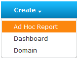
To launch the Ad Hoc Editor, choose Create > Ad Hoc Report:
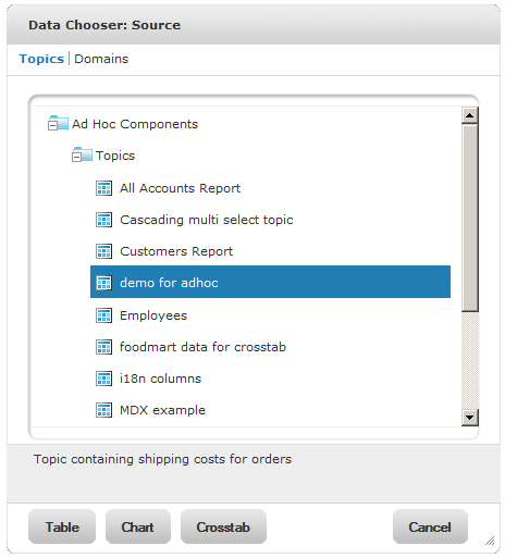
The Data Chooser wizard appears, you select a data source and report type, and the Ad Hoc Editor opens. In the Data Chooser you select data for the report from either Topics or Domains.
Topics and Domains are repository objects that provide a prepared view of a data source for Ad Hoc report design. Generally, an administrator or iReport user creates a Topic as a JRXML file. The JRXML Topic is then associated with a data source in the server. A Topic can also be created from a Domain in the server. Both types of Topics appear in the Data Chooser wizard when users create an Ad Hoc report.
Administrators create a Domain in the server that typically filters the data, creates input controls, and manages the list of available fields. A Domain specifies tables in the database, join clauses, calculated fields, display names, and default properties, all of which define items and sets of items for creating Ad Hoc reports.
Using a Topic instead of a Domain simplifies report creation. The following table compares creation of a report using a Topic versus a Domain. Using a Topic, which is actually an empty report, saves the report designer from choosing, pre-filtering, and changing display names of the data (steps 3-5 of Steps to Design a Domain-based Report):
|
Steps to Design a Topic-based Report |
Steps to Design a Domain-based Report |
|
1. Choose Create > Ad Hoc Report. |
1. Choose Create > Ad Hoc Report. |
|
2. Select a Topic. |
2. Select a Domain. |
|
3. Select the type of report: table, chart, or crosstab. |
3. Choose fields of data that can be used in the report. |
|
4. Design the report using the Ad Hoc Editor. |
4. Pre-filter the data. |
|
5. Change the display names of the data. |
|
|
6. Save the custom view of the data as a Topic. |
|
|
7. Select the type of report: table, chart, or crosstab. |
|
|
8. Design the report using the Ad Hoc Editor. |
For more information, refer to Creating and Uploading a Topic and Saving Domain Settings as a Domain Topic.
To open the Ad Hoc Editor window, you can select a Topic in the Data Chooser, and click a report type, Table, Chart, or Crosstab:
|
|
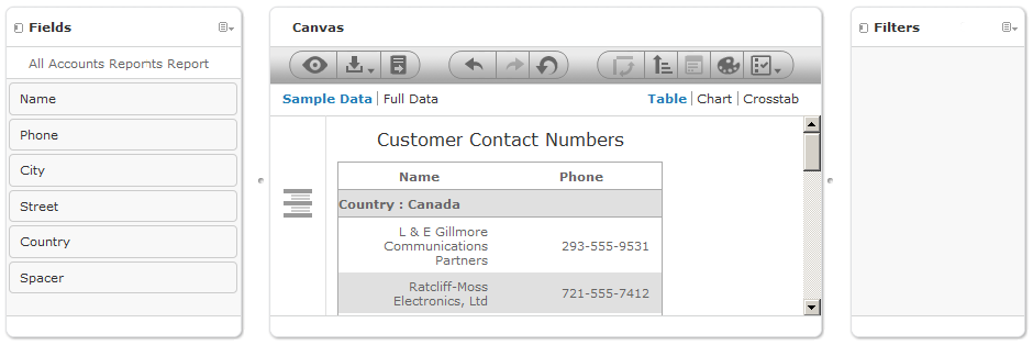
The Ad Hoc Editor window contains the following panels:
• Fields – Lists the fields of data available in the Domain or Topic.
• Canvas – Serves as the main report design panel.
• Filters – Retrieves a subset of data from the data source.
You drag and drop data from Fields to the Canvas to begin building a report.
|
|
The canvas includes Sample Data | Full Data options for displaying a subset of data or all the data in the report.
|
|
Depending on the configuration, JasperReports Server may load a Topic or Domain’s entire result set into memory when you edit or run the report. If the data policies are disabled, ensure that each Topic or Domain’s query returns a manageable amount of data, given the environment’s load capacity. Alternatively, you can change the data loading policy. For more information, refer to section Data Policies. |
The canvas also includes Table, Chart, and Crosstab options for resetting the report type. You can change the report type in the Ad Hoc Editor during the design or when you reopen the design for editing. The tool bar at the top of the canvas provides access to many functions of the Ad Hoc Editor. See "Ad Hoc Editor Tool Bar Icons" describes the tool bar.
.
|
Icon |
Name |
Description |
|||||||||
|
|
Presentation Mode |
Click this icon to hide the editor interface and view only the report. This mode provides a subset of the editor’s full feature set. For example, you can change summaries and datatypes for all report types; you can change the chart type, legends, and display options in charts and you can define sorting and the order and size of columns for tables. If the report includes filters created in the editor, those filters can be changed or removed. |
|||||||||
|
|
Save |
Place the cursor over this icon to open a menu of save options. Choose Save to overwrite the current report, or choose Save Report As to save it with a new name and location. |
|||||||||
|
|
Run |
Click this icon to run the report and see its HTML preview. This view opens in a new window or tab, and provides export options to formats such as XLS and PDF. When you run a report, you can change its filter and input control values but not its layout. |
|||||||||
|
|
Undo |
Click this icon to undo the most recent action. For example, if you added a field to a table, clicking this icon removes the field from the report area. |
|||||||||
|
|
Redo |
Click this icon to redo the most recently undone action. Redo is only available immediately after you click the Undo icon; any other action disables the Redo icon. |
|||||||||
|
|
Click this icon to revert the report to its state when you last saved. After you click Undo All, you can click the redo icon to recreate the steps you took before you clicked Undo All. |
||||||||||
|
|
Switch Group |
Click this icon to change the way groups are displayed. Depending on the tab you’re viewing, the behavior differs:
For more information, refer to section Switching Groups. |
|||||||||
|
|
Sort |
When working with tables, click this icon to view the current sorting (if any) and to select fields for sorting data. See section Sorting Tables. |
|||||||||
|
|
Input Controls |
Click this icon to view the input controls applied to this report. In some cases, you can select new values to change the data, for example, a date range displayed in the report. This icon is available only when input controls are defined for a JRXML-based Topic. For more information, refer to section Using Input Controls. |
|||||||||
|
|
Styles |
Click this icon to select a style that determines the fonts and colors in the report. You can’t undo a style selection. To deselect a style, click the Styles icon and choose a different one. |
|||||||||
|
|
Page Options |
Place the cursor over this icon to open a menu of page-level options. You can:
|
The Ad Hoc Editor provides the most frequently-used report types—tables, charts, and crosstabs:
• Table – Use tables to view values in the database and to summarize the values in columns. Each row corresponds to a row in the database. Rows can be grouped by identical values in any field with intermediate summaries for each grouped value. For example, a table report of product orders contains columns to show the dates and amounts of each order, and the rows are grouped by city and product.
|
|
Date Placed |
Date Filled |
Payment Received |
|
City A |
|||
|
Product 01 |
|||
|
|
Date |
Date |
Amount |
|
|
Date |
Date |
Amount |
|
|
Date |
Date |
Amount |
|
|
Date |
Date |
Amount |
|
|
Date |
Date |
Amount |
|
Product 01 totals: |
|
Count |
Sum |
|
Product 02 |
|||
|
|
Date |
Date |
Amount |
|
|
Date |
Date |
Amount |
|
|
Date |
Date |
Amount |
|
|
Date |
Date |
Amount |
|
|
Date |
Date |
Amount |
|
|
Date |
Date |
Amount |
|
Product 02 totals: |
|
Count |
Sum |
|
Product 03 |
|||
|
|
Date |
Date |
Amount |
|
|
Date |
Date |
Amount |
|
|
Date |
Date |
Amount |
|
|
Date |
Date |
Amount |
|
Product 03 totals: |
|
Count |
Sum |
|
City A totals: |
|
Count |
Sum |
|
City B |
|||
|
Product 01 |
|||
|
|
Date |
Date |
Amount |
|
|
Date |
Date |
Amount |
|
|
Date |
Date |
Amount |
|
|
Date |
Date |
Amount |
|
|
Date |
Date |
Amount |
|
|
... |
... |
... |
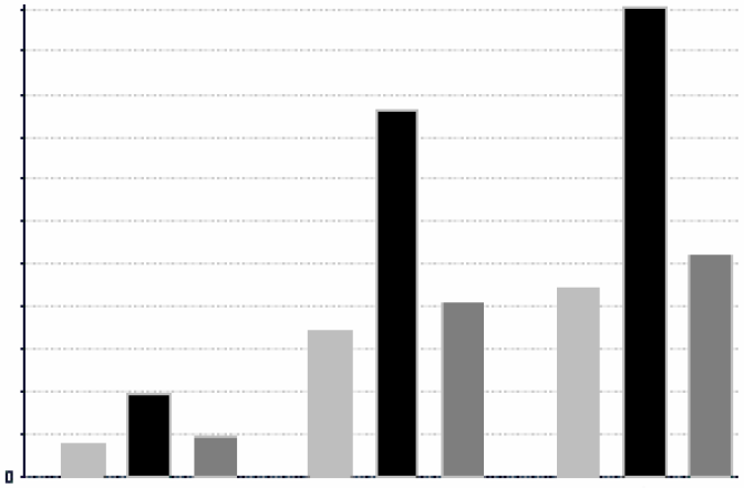
• Chart – Use charts to compare one or more measures across multiple sets of related fields. Charts summarize data graphically. Types of charts include bar chart, line chart, and pie chart. With the exception of time series and scatter charts, each type of chart compares summarized values for a group. For example, click the Chart tab to view the data in a bar chart that showed the sum of payments received for each of the products in each of the cities.
|
Total Payments Received |
||
|
|
||
|
City A |
City B |
City C |
|
|
||
• Crosstab – Use crosstabs to summarize data across multiple dimensions. Crosstabs are more compact representations than tables because they show only computed values, not individual database values. Columns and rows specify the dimensions for grouping; cells contain the summarized measurements. For instance, the example above could be displayed in a crosstab with columns grouped by sales manager and year.
|
|
Tom |
Harriet |
Manager Totals |
|||||
|
2007 |
2008 |
Year Totals |
2007 |
2008 |
Year Totals |
|||
|
City A |
Product 01 |
Filled Payment |
Filled Payment |
Filled Payment |
Filled Payment |
Filled Payment |
Filled Payment |
Filled Payment |
|
Product 02 |
Filled Payment |
Filled Payment |
Filled Payment |
Filled Payment |
Filled Payment |
Filled Payment |
Filled Payment |
|
|
Product 03 |
Filled Payment |
Filled Payment |
Filled Payment |
Filled Payment |
Filled Payment |
Filled Payment |
Filled Payment |
|
|
Product Totals |
Filled Payment |
Filled Payment |
Filled Payment |
Filled Payment |
Filled Payment |
Filled Payment |
Filled Payment |
|
|
City B
|
Product 01 |
Filled Payment |
Filled Payment |
Filled Payment |
Filled Payment |
Filled Payment |
Filled Payment |
Filled Payment |
|
... |
... |
... |
... |
... |
... |
... |
... |
|
|
City Totals |
Filled Payment |
Filled Payment |
Filled Payment |
Filled Payment |
Filled Payment |
Filled Payment |
Filled Payment |
|
 Product 01
  Product 02
  Product 03